
Gram City
All about the GLOW
UX Design | Design Sprint
My Role
As a solo UI/UX designer, I do user research and design work for this design sprint. It takes 5 days to complete.
Gram City is a mobile app that aims to help people find the best Instagrammable places in any city around the world so that users can take a picture there, including photos of tourist attractions, famous landmarks, interesting architecture, and art design to provide inspiration for your next Instagram image. A design feature for this app is to make it easier for users to find these places where they can take pictures, wherever they may be. Besides helping users find and share their favorite places, the app also creates an active community which helps users create and maintain an active community.
Overview
In order to find the right place to take photographs, people spend quite a bit of time researching the area that they want to photograph. Oftentimes, they overlook a great spot before they arrive at their destination but take a picture of the view instead. Using GramCity, users can find the best places to take photos and find out where they should take them. Furthermore, the site also offers a community in which users can share their favorite locations and find new ones to explore.
Constraints
-
The solution is to design a feature for Gram City mobile app.
-
Focus on helping users to find great photo-ops near them
-
Create a community for users who share their favorite locations to take pictures .
Process
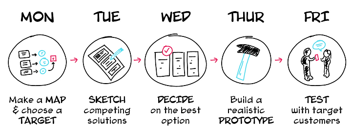
Day 1 - Map
Users were asked how they currently find places to take photos. The goal of the first day was to understand user's frustrations through user research on why they struggle with finding locations to take good pics.
Interview Notes
Based on existing user research on the problem, I found some insights from the research:
-
Users are interested in taking pictures including art, hidden gems, architectures and more.
-
Users like to take photos near them without spending too much time to plan a trip.

Persona
I created two personas with two users’ basic information, goals and frustrations. Personas allowed me to understand users’ painpoints and purpose. It helped me generate possible ideas based on users’ need.


How Might We?
Having obtained the insights mentioned above and determined the personas, I was able to ask three important "How Might We" questions to myself:
-
How might we help users to find good locations near them to take pictures.
-
How might we help users spend less time researching to find good location on social media before they head to their destination.
-
How might we create a community for users to share their photos and travel experience with other users.
Map

Day 2 - Sketch
The second day of a design sprint is to sketch ideas and generate possible solutions. Firstly I get inspiration through competitor’s products and related products, then with the foundation on the first day I used the method crazy 8s to sketch my solutions.
Lightning Demos
Based on the results of the study, it can be concluded that most of the features are already available in major competitors. My goal is to get some inspiration from Evergreen, Paired, Lasting and Between by understanding how they work. In order to avoid couples from having to use multiple apps to accomplish the same task, it is essential to integrate all the important features into one app. As a result, I discovered that some competitors have some features that are focused on hyper-customization for users based on an in-depth psychological assessment based on a wide range of factors. Weekly updates of progress are sent to users so they can keep track of how they are doing over time.


Crazy 8s
Lighting Demo gave me a lot of inpiration then I used the crazy 8s method, I brainstorm some ideas to help users find the best place to take photos. I referred back to map on first day and created possible solutions for users.

Critical screens
Three most critical screens helped me understand how the users interact with an interface, what results from their interactions, and what the user will do next. Once users allow the app to track their current location, the app will take users to a map page. Users can see what attractions are near them. They won’t miss travel experience while they take pictures.

Day 3 - Decide
The third day was focusing on creating critical user flows. After comparing different solutions, I decided which one worked for this case. I created two flows:
-
Map flow: Tracking users’ location to help them find best place to take pictures near them. Users can also check the details about different locations.
-
Community group flow: Using community group to share users’ travel experience with other travelers.

Day 4 - Prototype
Once paper sketches were done, I used figma to create a digital version of sketch-wireframe. The wireframes are based on user personas with details elements. Users wants to find locations before planing trip and they want to find places near them. I collected users' needs and frustrations to design the features the users want to see on the app.

Then I applied UI elements and create a high fidelity prototype to let my users test.
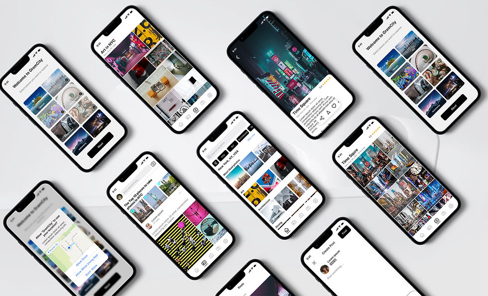
Category Select and track location
When users open the app, the system will ask their preferences. Also, it will ask the user's permission to track their location.

Search location and map view
Once the app tracks user’s location, the system will recommend good photo shooting places near the users. Users can switch to map view to see what interesting places are near them. Users can also check the locations details. By viewing the gallery, users will see other users photos for the same place.

Category gallery and location details
When users land on the home page, they can view the category gallery and check the location details.

Community and create post
In the Community, users can view the ranking of top places for taking pictures voted by other users. They can also view, comment and like posts from other travelers in the community. They can create posts about a specific place and share their travel experience with other users.

Day 5 - Test
The last day is to test my design with target users. I recruited 5 users to test GramCity prototype by giving them following tasks to complete:
Task 1: Selecting favorite places to explore and allow to track current location
Task 2: Selecting one nearby photo location and view the gallery
Task 3: Explore category gallery and find find one specific location details
Task 4: View the community posts and create a post
Usability test results
All users were able to complete the tasks. Some major findings include:
-
Users want to know where specific photos were taken.
Solution: add pictures’ info, including address and map.
-
Users were confused about the onboarding page, if they can select multiple places or only one.
Solution: rename “ what are your favorite place to explore to “ select places you want to explore.”
-
When users are on “map view”, they expect to see a “list view” of locations instead of going back to the original home screen.
Solution: rename: add “list view” button on map screen.
Wrap up
The 5 days design sprint is the fast way to generate the best solution and test it out. It is good way to design the new features for existing app. It allowed me to save time and get efficient work done in one week.